VIDEOS
 EPISODE 1What is CSS?What is CSS and what do we use it for?
 EPISODE 2Three ways to write CSSThe three different ways to write and practice CSS
 EPISODE 3CSS Selectors in 1 MinuteBasic CSS selectors like ELEMENT, CLASS, and ID
 EPISODE 4ColorsHow do Colors work in CSS?
 EPISODE 5Colors (DEMO)Live Coding: CSS Colors
 EPISODE 6Absolute SizesWhat is Absolute sizing in CSS and when to use it?
 EPISODE 7Relative SizesWhat are relative sizes in CSS and when are they used?
 EPISODE 8EM & REMThe two most commonly used relative sizing metrics in CSS
 EPISODE 9Sizing (DEMO)Live Coding: CSS Sizing
 EPISODE 10CSS Box ModelThe most important foundation of every HTML element: Box Model
 EPISODE 11Box Model (DEMO)Live Coding: Box Model
 EPISODE 12FontsHow to use system and custom Fonts in CSS
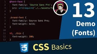 EPISODE 13Fonts (DEMO)Live Coding: CSS Fonts